
Role: Product Designer
Tools: Figma
Year: 2022
Goals and Motivations
To showcase my skills with Figma and animations
To show my creativity and vision for intuitive EdTech products
To emphatically design a unique digital solution through user research that saves teachers’ time, space, and paper while streamlining the process for students
Empathize ◈
Define ◈
Ideate ◈
Prototype ◈
Test
〰️
Empathize ◈ Define ◈ Ideate ◈ Prototype ◈ Test 〰️

What are student data binders?
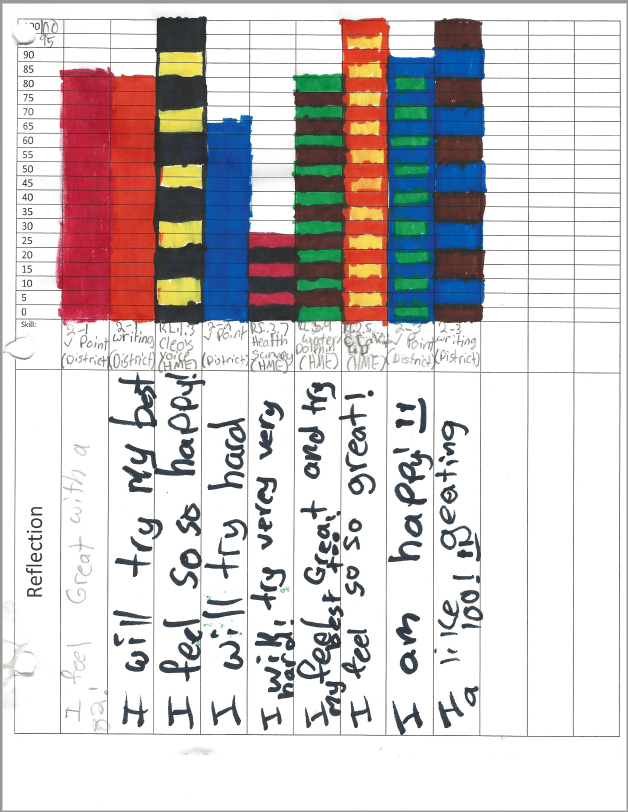
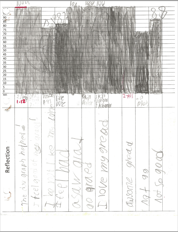
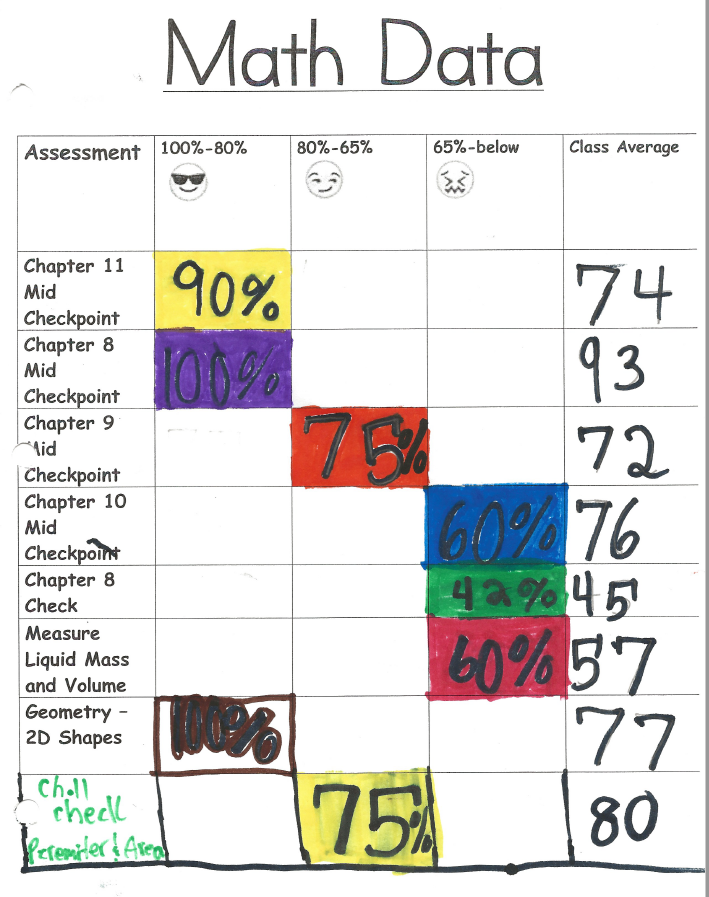
Typically, they are 3-ring binders that students use to track, store, and reflect on their test grades for each quarter. Many school districts require teachers to utilize them. They help students to take ownership of their grades and research shows it may help to improve future performance. Additionally, they teach students the importance of data, are a great resource to show in various conferences, and mitigate the chance for students being surprised of their final grades. Below are several real third grade student data trackers and a binder.

User Research
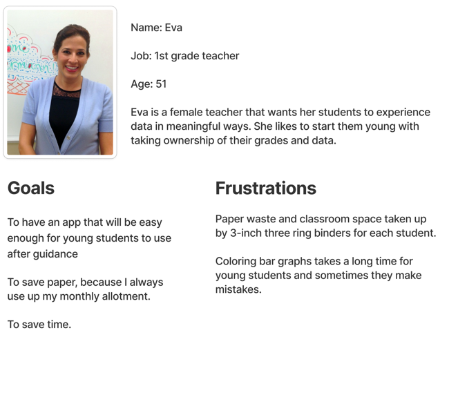
User Personas
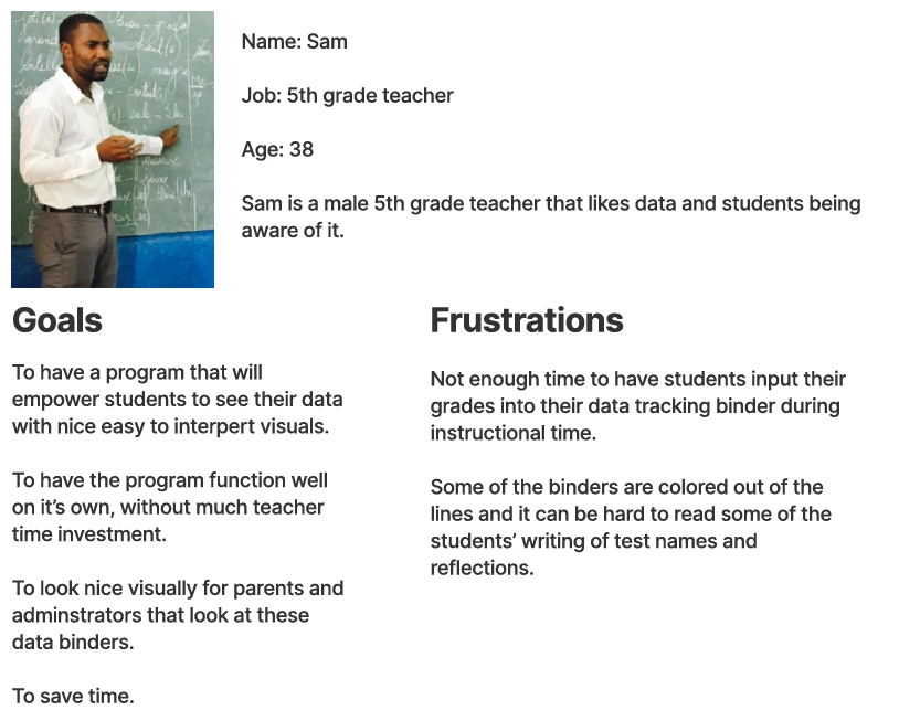
I conducted phone interviews with two elementary school teachers to research their goals for a digital solution and their frustrations with the status quo of tangible student data binders. I experienced most of the pain points my users reported, which made this project personal.
Pain Points
These trends emerged from the user research.
Time Consuming: 3-hole punching tests for binders, gathering and passing out data binders, helping to erase/white out mistakes, and students that slowly color bar graphs
Waste Paper: Traditional data binders contribute to paper waste and some schools limit teacher paper allotment because they use too much
Paper data trackers and important assessments can easily tear out of the binder and get lost
Students cannot take them home and do not have 24/7 access
May look sloppy, especially with younger students

Information Architecture
When you’re embarking on a new journey it’s nice to have a map.

Pattern Library
After completing the Low-fidelity prototypes, I created a pattern library to save time and produce a more consistent design for Binder’s High-fidelity prototypes.


Solutions
I utilized the user research and information architecture to bring Binder to life.
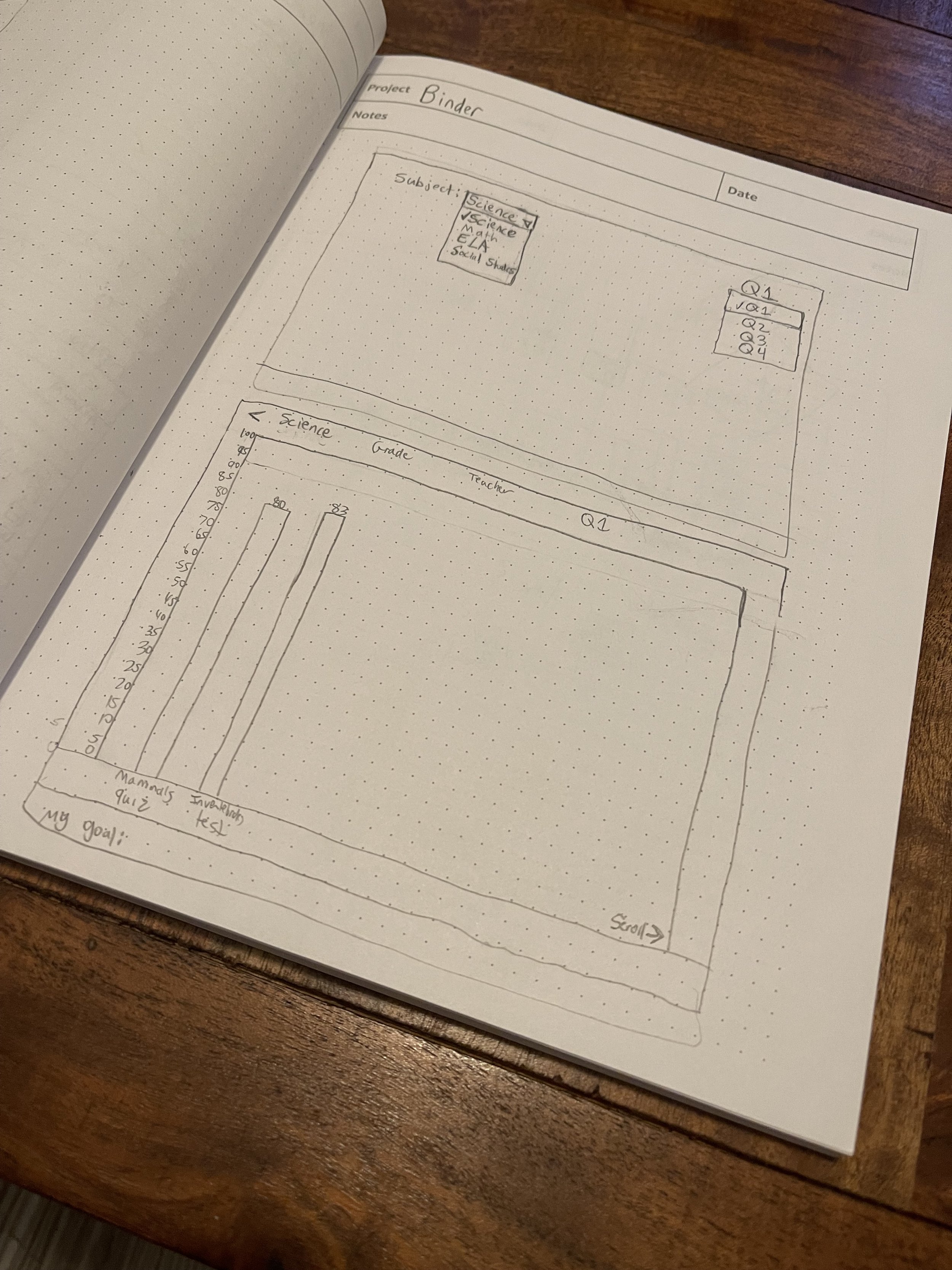
Early sketches of Binder
Low-fidelity prototypes
High-fidelity prototypes
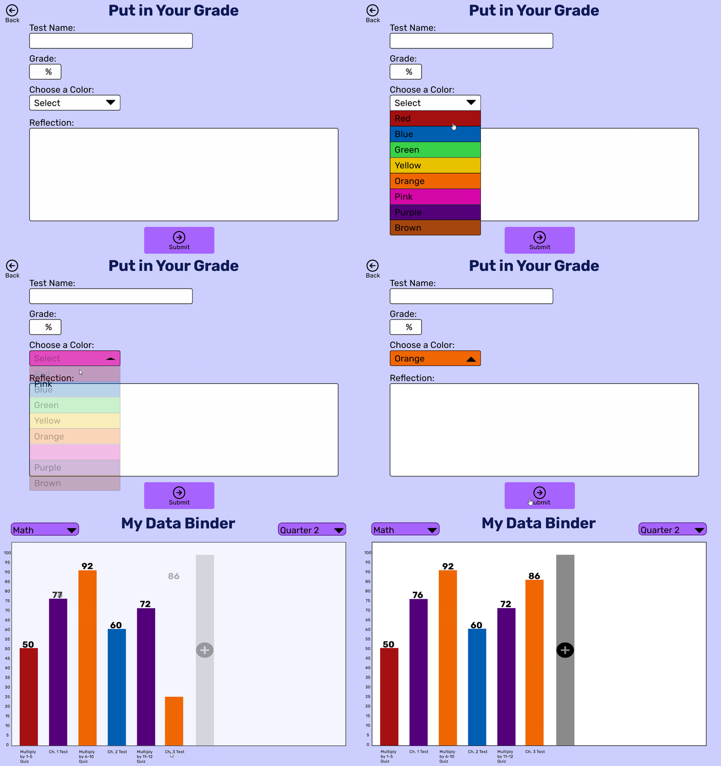
Add a New Grade
Viewing Old Data and Reflections
Additional Hi-Fi prototype screens

Seeing is Believing
Task 1: Add a grade
Change the subject to math
Add a bar
Select the color orange
Submit
Task 2: View past data
Change quarter 1 to quarter 2
Change the subject to social studies
Hover over bars to see past reflections

Usability Testing
I conducted moderated tests of Binder’s dynamic prototype with Sam, Eva, and two of Eva’s children to see if they could complete two important user tasks.
User was able to complete the desired task
✅= Yes ❌= No
Task 1: Add a grade
Sam ✅
Eva ✅
8-year-old student ✅
15-year-old student ✅
Task 2: View past data
Sam ✅
Eva ✅
8-year-old student ✅
15-year-old student ✅
🎉Binder was off to a great start. I was pleased with the results even though I tested a small sample. Binder’s simplicity and intuitive design allowed the users to complete my desired tasks.

Next Steps and Lessons Learned
I would continue to test Binder with younger students to ensure they didn’t get stuck on any user pathways. I would conduct another round of user research with more teachers at the elementary, middle, and high school level in preparation for the teachers’ view of Binder. Some features I would conduct user research on:
Teacher and/or student erroneous assessment deletion permissions.
Optional teacher settings that would restrict the colors students can select because some teachers may want color coordinated bars. For example: red=0-69%, yellow = 70-79%, green = 80-100%.
Accessibility: I want to discuss some of the specific accommodations teachers provide their students for 504 plans and IEP’s. This will help me to include them in the accessibility settings.
What I Learned
I learned that in product design there are multiple problems to solve but designers must focus on the most important ones that will make the greatest impacts. Additionally, I learned to keep designs and user pathways as simple and functional as possible, especially when designing for students. I’ve been inspired and give credit to Steve Krug’s book Don’t Make Me Think, Revisited. I learned to instill a mindset that fosters intuitive designs. Designers should aim to make the user experience effortless. I believe that’s why my dynamic prototypes performed well in testing.
In regards to mistakes, I didn’t create a component for the main dropdowns (subjects & quarters). After designing several Hi-Fi screens, I noticed that I needed to lower the position of the dropdown icon. Therefore, I went back to my Pattern Library and created components for the subjects and quarters which replaced the originals. This wasted time. Later, I needed to change the colors of the dropdown. I was grateful that I created a dropdown component or I would have wasted more time manually changing each one. I learned to focus on thinking about what designs will be reused often. I will make components a priority before getting into the Hi-Fi prototypes.
While you’re here, why not view another project!
Peloton App Redesign is a fitness technology project
AITA is an EdTech Learning Management System
