Peloton App Redesign
Improving the Peloton app through strategy and design
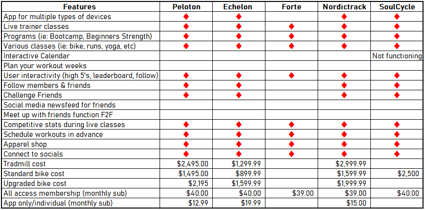
Peloton is a public company that revolutionized working out at home. Peloton livestreams “Live” classes with over 50 professional workout instructors. There are also thousands of prerecorded classes known as “Encore” classes. Users pay $39 for the All Access Membership to work out with their own body (walking outdoors) or with Peloton’s products (indoor bike and/or treadmill). This redesign was completed in one month and it targeted several vital app improvements that were driven by users to help Peloton retain it’s juggernaut status.
Disclaimer: I’m not affiliated with Peloton and these views for this case study are my own.

Role: Product Designer
Tools: Sketch, Microsoft Excel, Canva, Lucid, and TeamViewer
Year: 2021
User Research
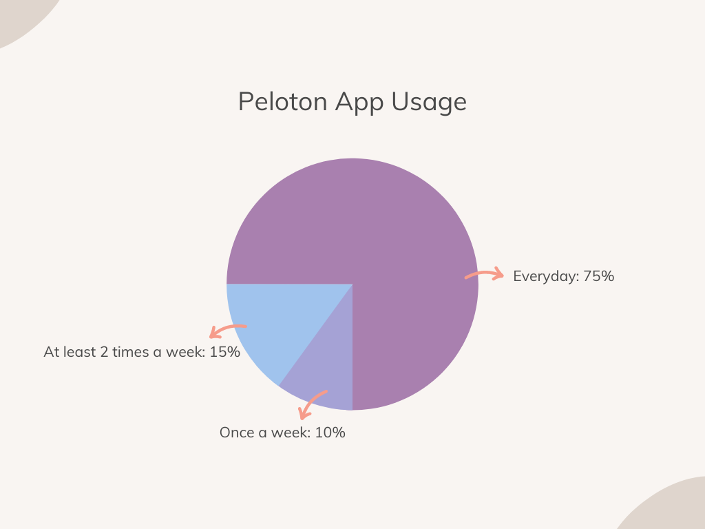
I created an online survey and I had 18 respondents, most reported being frequent users. I conducted 2 user interviews by phone. In total, I researched 20 users. The male interviewees’ age ranged from 22-47, the females ranged from 24-65, and the non-binary respondent was 26. I feel this was a fair sample and properly represented the core users of the app.
The Key Takeaways
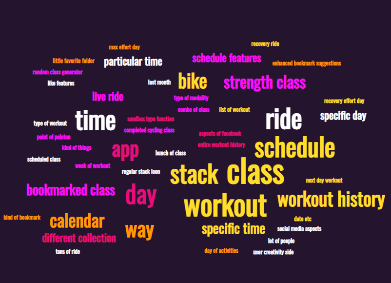
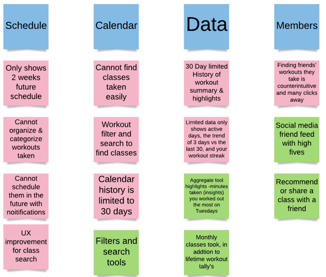
No way to organize prerecorded Encore classes. Users want to take these classes again and schedule them in advance, since “the bookmark feature is not enough.”
The scheduling section of the app has some issues and potential.
A clear lack of data analytics.
The calendar was not interactive and only stores a 30-day history.
Lack of interactivity with friends in the app.
An in-person friend meetup feature (where Peloton members could work out together) was unpopular.
The Challenge
With this new redesign, I wanted the Peloton app to be more interactive, engaging, and personalized by improving users’ class collections, calendar, workout data, and friends screens.

Problems Solved

My Collections
-
Solution: My Collections
This is a new screen I designed, entitled “My Collections.” In here users may create folders, place, and organize their favorite workouts.
-
My Collections Demo
This demonstration showcases a user creating a new folder and naming it. The user has already created multiple folders but wanted to create a new one to store their favorite “Fun Runs.”
-

Old screen's disorganized bookmarks
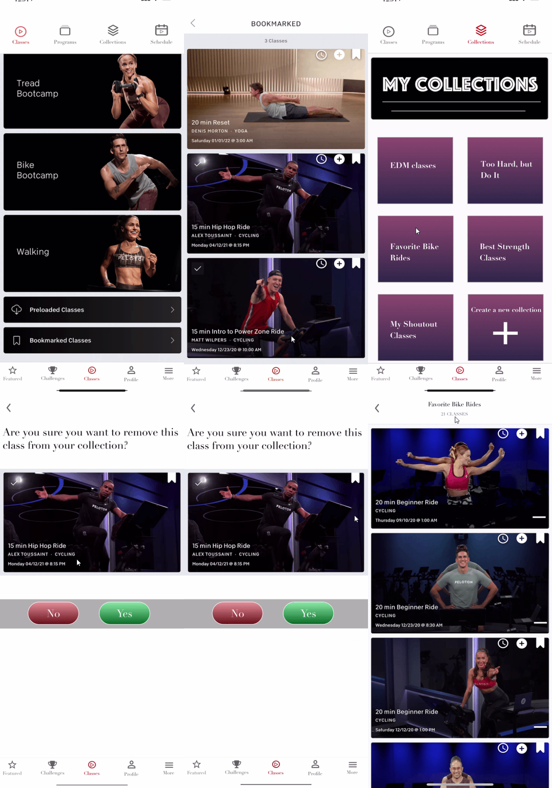
This is the old path users take to get to a past workout that is bookmarked. The workout type doesn’t matter, all of the classes are lumped into a long vertical scroll. The workout cannot be scheduled, so users must begin it immediately.

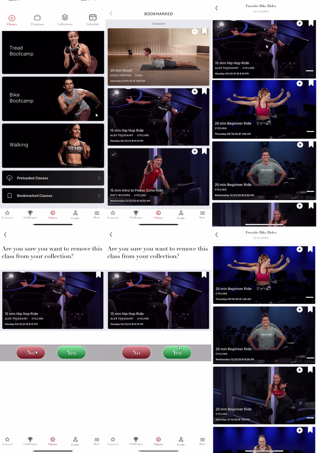
Below, are two intuitive methods for users to add workout classes into their collections. I created a circle with a plus icon that goes on class thumbnails. Once tapped, the user can choose a collection folder to add the workout into.
Classes Path
This path enables users to organically add classes to their collection folders by looking through workouts that are organized by type on the home page.
Bookmark Path
This path allows users to add classes they previously bookmarked into their collection folders. In addition, I demonstrated a way that a workout can be removed from a collection by tapping on the white minus icon and following the prompts.

Schedule Classes
This is a new feature for users to schedule encore workouts as far in advance as they wish.

Calendar: Now Interactive and Workout History Increased
-

New Calendar & Workout Screens
Now, users can tap on blue circled days, instead of having to incessantly scroll through old workouts. Users can also tap on the date and type in a specific month/day/year to see what workouts they took in the past or have planned to take in the future.
-

Calendar: Past & Future
In this demo, I show the arrows functionality for past (November), current (December), and future months (January & February). The user wants to see their scheduled future classes for February 1, 2022.
-

Old Calendar & Workout Screens
In the old Peloton app screens users are unable to tap on the days they worked out. If they want to see their prior workouts they must clock the “workouts” tab and vertically scroll. Users are limited to only view the days they worked out, signified by a blue circle and white number(s).

Enhanced Data & Metrics
-
New Data Screen
The bar chart is a great visual for users to see their total miles traveled per month. I based the data insights on users’ favorite metrics from my interviews and surveys. I added green and red trend arrows for visual enhancements. I conceptualized the “tips” text as a fun way to increase Peloton’s engagement with users.
-

New Data Demo
Now, users can scroll below the calendar to view their workout data and metrics in greater detail.
-
Old Data Screen
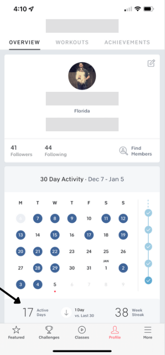
The workout data is very limited here, only displaying users active workout days for the month, their workout days vs the last 30, and their week streak which is based on working out at least once each week to extend it.

New Friend Features

New Friends’ Screen Demo
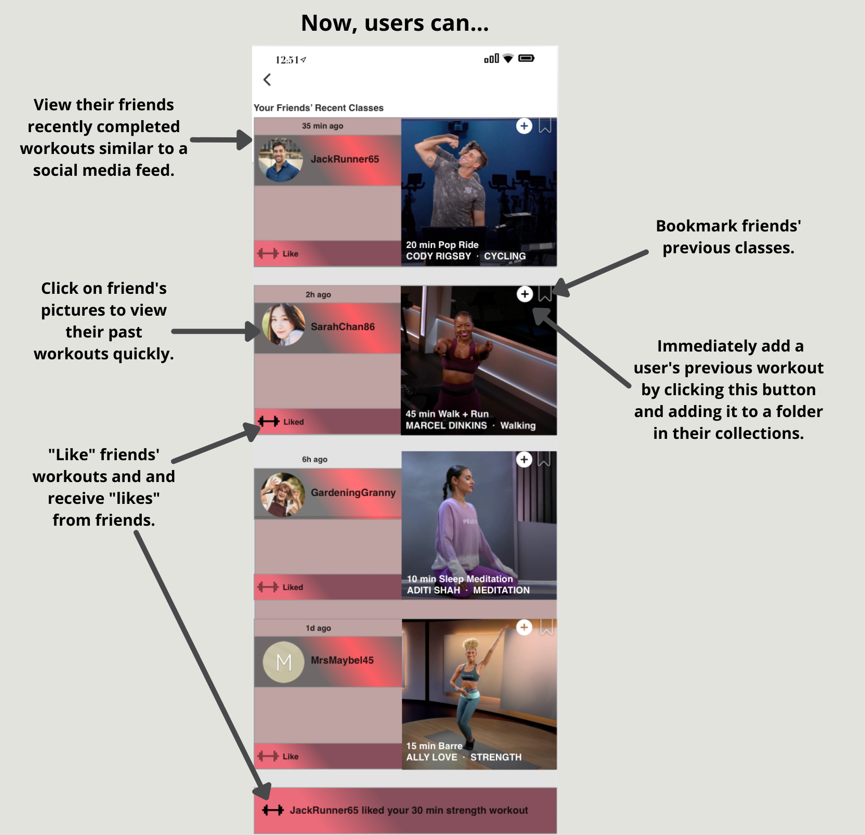
This demo shows the new Friends section, “liking” a friends workout, seeing your “likes” from a friend, and adding a friend’s recent workout to your collection. This makes friend interactions more fruitful, engaging, and fun. The Friends section on the new home screen has a notification bell with numbers that correlate to new '“likes” and when a friend finished a workout.

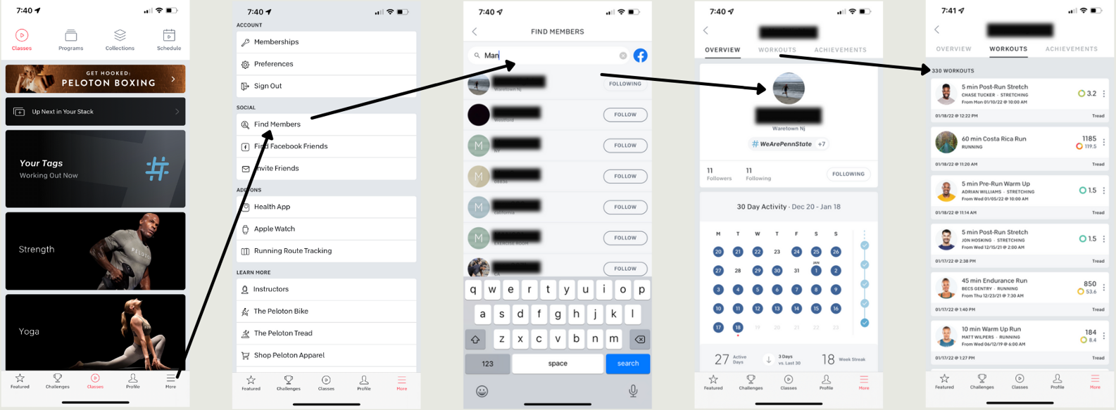
The old user flow: Cumbersome and users must memorize their friend’s handle to find them and see the workouts they completed.
Usability Testing
II conducted usability testing on the interactive prototypes with five participants. Two were completed in person and the other three were conducted remote and moderated via TeamViewer. I gave them multiple tasks to test the usability of my prototypes. My goals including seeing if users could navigate and utilize new features and to watch for confusion and/or pain points. Last, I asked them how they felt and what they liked or disliked about the changes.
Results
🚴🏿🚴🏿🚴🏿🚴🏿🚴🏿 5/5 users were able to change the class type from the schedule view with the arrows.
🚴🏿🚴🏿🚴🏿🚴🏿🚴🏿 5/5 users were able to add a class to a collection from the bookmarked screen.
🚴🏿🚴🏿🚴🏿🚴🏿 4/5 users were able to add a class to a collection from the workouts on the homepage.
🚴🏿🚴🏿🚴🏿🚴🏿🚴🏿 5/5 users were able to tap on a calendar date to check their workouts on that specific day.
🚴🏿🚴🏿🚴🏿🚴🏿🚴🏿 5/5 users were able to tap on the calendar sync function date to check their workouts on that specific day.
🚴🏿🚴🏿🚴🏿 3/5 users were able to schedule a bookmarked class in the future.
🚴🏿🚴🏿🚴🏿🚴🏿🚴🏿 5/5 users were able to locate the data analytic under “Profile.”
🚴🏿🚴🏿🚴🏿🚴🏿🚴🏿 5/5 users were able to find the friends’ screen and “like” a friend’s post.
🚴🏿🚴🏿🚴🏿🚴🏿 4/5 users were able to add a friend’s recent class to their collections.
Feedback from Prototype Testers
🏆 “This is everything I’ve been wanting from their app.”
🥇 “I love the 'My Collections’ section, it’s a total gamechanger!”
💪 “The calendar is very helpful. I can rest easy knowing my past workouts won’t erase now and are finally organized.”
🏋 “I would be checking my ‘Friends’ section every day to see all of the strength classes my friends took.”
🎯 “I like the data box you made because it automatically tracks how well I’m doing each month.”
Hello, World!
Results
I developed high fidelity interactive prototypes that would enable Peloton to increase user satisfaction exponentially and reprise their juggernaut app status with new features and improvements. I reinforced my beliefs about the importance of user research and design thinking. The users are always at the heart of every decision designers make. Even though I was well-versed with this app, the interviewees came up with a few pain points I hadn’t experienced and solving them made a huge difference. Also, I had several tradeoffs: I thought that a meetup feature might be edgy and useful, but it wasn’t a problem. Also, a buggy e-commerce page that needed tending from engineers was out of my hands and a workout search tool was not built into my redesign. I was reminded that it’s great to stay humble and be open-minded when conducting user research. At first, I was a tad nervous as I knew this would be a great undertaking from a polished product that has a team of designers working on it. Despite this, I knew this personal project was the perfect opportunity to hone and showcase my mobile design skills.
