AITA was a solution for the lagging and legacy Learning Management Systems (LMS) that colleges utilize. The current market falls short in several crucial areas. The goal was to create a revolutionary LMS that would meet all users’ needs. It was designed for a startup: Nikola Advanced Research Laboratories Inc. AITA was designed at a lower fidelity to flesh out the UX, concepts, and important screens as a minimum viable product. All from scratch.
User Research
There were three specific types of users for this product: students, faculty, and administrators. These three users umbrella into more broad demographics in their respective categories. I conducted interviews with students, faculty, and administrators. I needed to learn about all of their different problems and needs with their current and past learning management systems. I interviewed four administrators, twenty faculty, and forty students. In general, the students were aged 18-29, faculty that teach courses were 30-75, and administrators that help run the college were 45-75. I learned that colleges needed a better user experience, new tools targeted at a younger generation, and data solutions for their LMS.
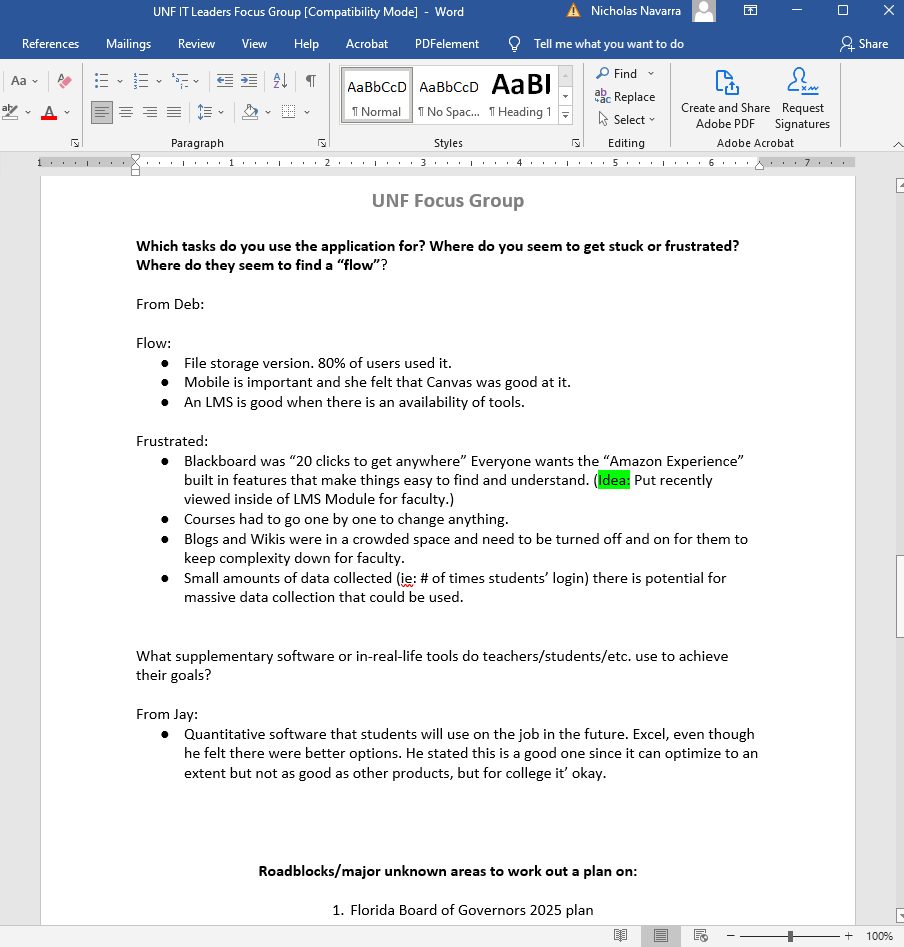
A sample of the user research I complied from IT leaders.
Brainstorming student LMS content from the user research and general LMS research.
This is a student user persona I created from my interviews.
I created a competitive analysis for the current LMS market and presented it to the company. This is a sample of one of the Excel sheets.
LMS research that helped to guide my designs
Additional research I compiled into charts and PowerPoint presentations for my team, stakeholders, and prospective investors.
Brainstorming & sketching solutions from my research
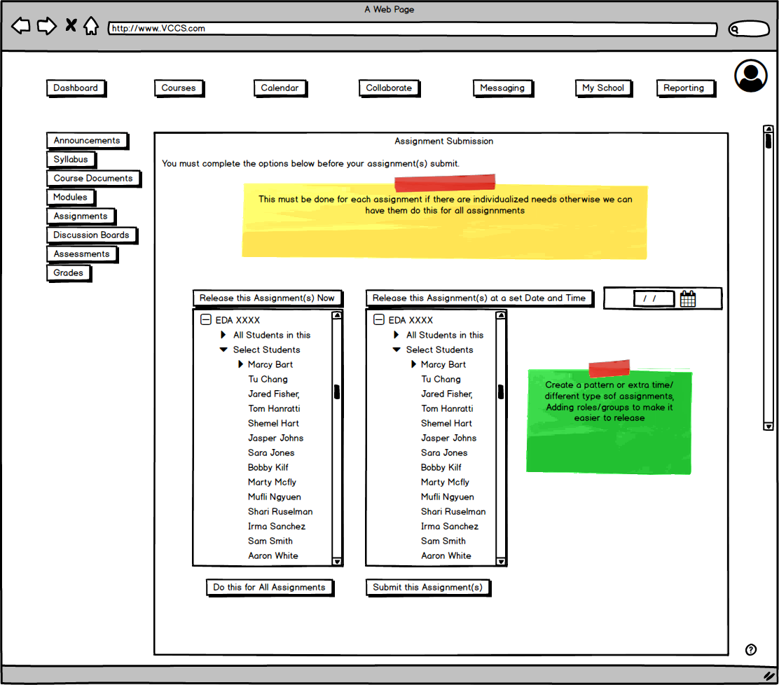
Faculty assignment submission
Faculty user settings
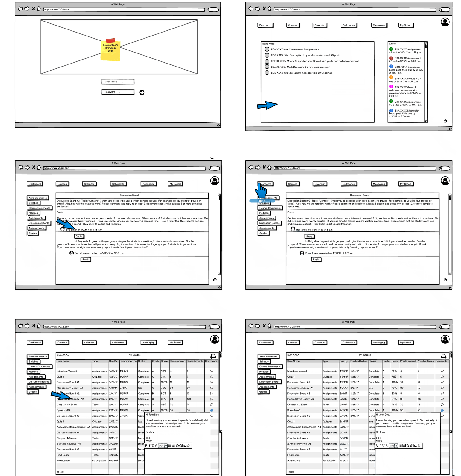
Faculty dashboard
The Challenge
How can I improve the learning management software experience?
Although we have all the technology at our disposal, the LMS experience has not advanced much with the times. A lot of users (students, faculty, and administration) still face difficulty interacting with the software, data issues, decreased engagement, and a lack of beneficial features. I discovered that the users had many different problems, needs, and hopes.
Problems Solved
UX 😀 ↑
Improved user experience with intuitive dashboards and less clicks to get places. Faculty can easily arrange, navigate, and manage their courses. Student navigation is a breeze.
Plug & Play
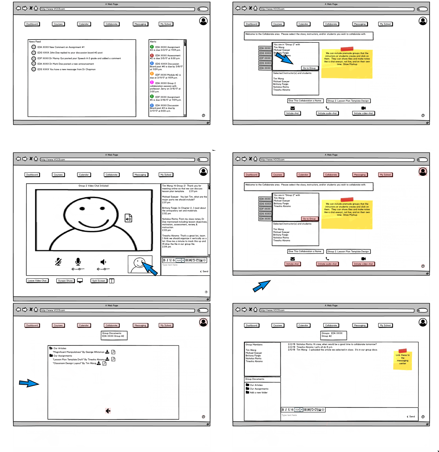
AITA is an all in one app. Say goodbye to buggy 3rd party apps. I designed a dedicated video call and/or chat collaboration tool for faculty and students. Video calls and text chats are only a few clicks away.
Smart Calendar + Alerts
Designed to keep students and faculty on track for the important stuff. It syncs to your digital Google calendar for important dates and reminders. The alerts are fully customizable, never miss an assignment, meeting, or class again. In the pipeline: the option to connect Amazon Alexa and Google Home to this calendar for AI integration.
Quick Attendance
One surprising finding was that administrators at colleges thought that calling role was a huge waste of time and that it was a problem. They’re not wrong, if it wastes just 5 minutes each class, that would save about 80 minutes per instructor per semester. If you multiply that by hundreds of professor’s, that’s a lot of time saved for instruction and learning. Therefore, I designed: Quick Attendance. This allows faculty to easily generate a unique QR code. Students scan the QR codes as they walk into the classroom with a device preferably from projector screen, but it can also be printed. The teacher can view who is absent and present with ease, they can also manually edit it.
Results
Through completing solid user research, a convincing competitive analysis, and a Lo-Fi prototype for MVP the founders were able to create a considerable pitch for this product and the company. This helped company to secure a successful seed round. Designing an enterprise level product that all people will use every day in a college requires a level of thoroughness and dedication to build successfully. Low fidelity prototypes of the LMS were created for students, professors, and administrators. This allowed Nikola Advanced Research Labs to create a product with minimal risks and to perfect the user experience first. I learned valuable information by interviewing from all users, all that were very happy to help. They had several important needs and challenges that I didn’t come up with on my own research. I know how vital it is conduct thorough user research. The next steps would be to create high fidelity prototypes and conduct more usability testing.


